At the beginning of this series, we designed a simple web page which we then took and made an HTML document. Now it’s time to style that HTML document with CSS so the browser will display it the way we want. This is the stage where our website will take on its own personality.
Remember how we added some extra div elements in the previous article for styling purposes? Well, those are the “hooks” into the elements we’re going to be styling with CSS. That will allow us to tell CSS how we would like them to look. Before we use CSS however, we’ll need to let the browser know where to find the CSS file so it can parse it for use in the HTML document. Remember when we created our initial document there was a “head” section for metadata? Well, that’s the place where external links to resources like CSS, Javascript, and our fonts will go. When the browser receives an HTML document, it parses the data starting from the top and scanning the code line by line. When it finds a link to an external resource file the browser will temporarily stop parsing the document to go request that resource and parse it before finishing the rest of the document. It will do this for each resource link it finds in the document; images, CSS, Javascript, Fonts, etc. Let’s add a link to our blank CSS document we created earlier. While we’re at it, let’s go ahead and add the page title with some other metadata that will help the browser understand our website.
prerequisites
I’m assuming you have at least a basic understanding of CSS for this series. If not, it may be hard to follow along. Let’s begin styling our page!
Below is the HTML document we created in the previous article.
The full HTML document
<html>
<head>
<title>Page Title</title>
</head>
<body id="home-page" >
<header id="main-header" >
<section id="hero">
<div class="container clearfix" >
<div class="hero-left" >
<h1> <span class="small-text" > Biggest, Sweetest </span> <br> Cherries </h1>
<a href="#" class="btn" > Order Fresh </a>
<span class="or" > Or </span>
<a href="#" class="btn" > Pick your Own </a>
</div>
<div class="hero-right" >
<div class="hero-image" >
<img>
</div>
</div>
</div>
</section>
</header>
<main>
<section id="quotes">
<div class="container" >
<div class="quote-bg" >
<div class="quote" >
<blockquote>
<h2>Jack</h2>
<span> They were the sweetest, juiciest cherries I've ever had! </span>
<img>
</blockquote>
</div>
</div>
</div>
</section>
<section id="benefits-wrapper">
<div class="container" >
<div class="row" >
<div class="benefit item" >
<div class="item" >
<div class="left" >
<a href="#" > Delicious </a>
<img>
</div>
</div>
<div class="item" >
<div class="right" >
<ul class="cherry" >
<li> Juicy and plump </li>
<li> Sweet and delectable </li>
<li> Ripened to perfection </li>
</ul>
</div>
</div>
</div>
<div class="benefit item" >
<div class="item" >
<div class="left" >
<a href="#" > Healthy </a>
<img>
</div>
</div>
<div class="item" >
<div class="right" >
<ul class="cherry" >
<li> Good for your heart </li>
<li> Increase proper blood flow </li>
<li> High in vitamin C </li>
</ul>
</div>
</div>
</div>
<div class="benefit item" >
<div class="item" >
<div class="left" >
<a href="#" > Convenient </a>
<img>
</div>
</div>
<div class="item" >
<div class="right" >
<ul class="cherry" >
<li> Easy to wash </li>
<li> Good snacks </li>
<li> Take them anywhere </li>
</ul>
</div>
</div>
</div>
</div>
</div>
</section>
<section id="stats-wrapper">
<div class="container" >
<div class="row" >
<div class="item" >
<div class="stat" >
<span class="stat-figure" > 903 </span>
<p class="stat-text" > Satisfied Customers </p>
</div>
</div>
<div class="item" >
<div class="stat" >
<span class="stat-figure" > 355 </span>
<p class="stat-text" > Acres of Trees </p>
</div>
</div>
<div class="item" >
<div class="stat" >
<span class="stat-figure" > 1034 </span>
<p class="stat-text" > Pounds of Cherries </p>
</div>
</div>
</div>
</div>
</section>
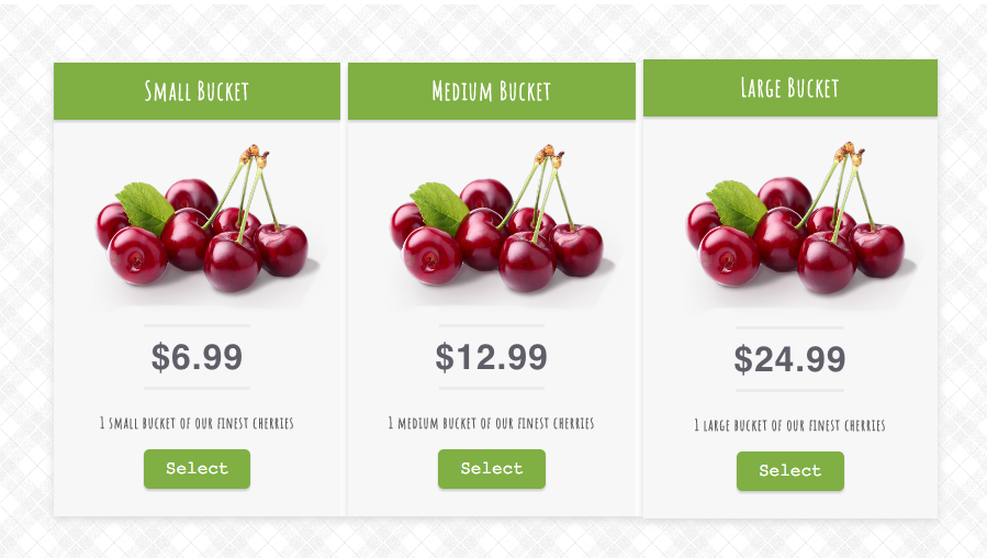
<section id="pricing">
<div class="pricing-wrap row clearfix" >
<div class="item package" >
<div>
<div class="package-title" >
<p> Small Bucket </p>
</div>
<img>
<hr>
<p class="price" > $6.99 </p>
<hr>
<div class="price-description" >
<p> 1 small bucket of our finest cherries </p>
</div>
<a href="#" class="cta" > Select </a>
</div>
<div class="item package" >
<div class="package-title" >
<p> Medium Bucket </p>
</div>
<img>
<hr>
<p class="price" > $12.99 </p>
<hr>
<div class="price-description" >
<p> 1 medium bucket of our finest cherries </p>
</div>
<a href="#" class="cta" > Select </a>
</div>
<div class="item package" >
<div class="package-title" >
<p> Large Bucket </p>
</div>
<img>
<hr>
<p class="price" > $24.99 </p>
<hr>
<div class="price-description" >
<p> 1 large bucket of our finest cherries </p>
</div>
<a href="#" class="cta" > Select </a>
</div>
</div>
</div>
</section>
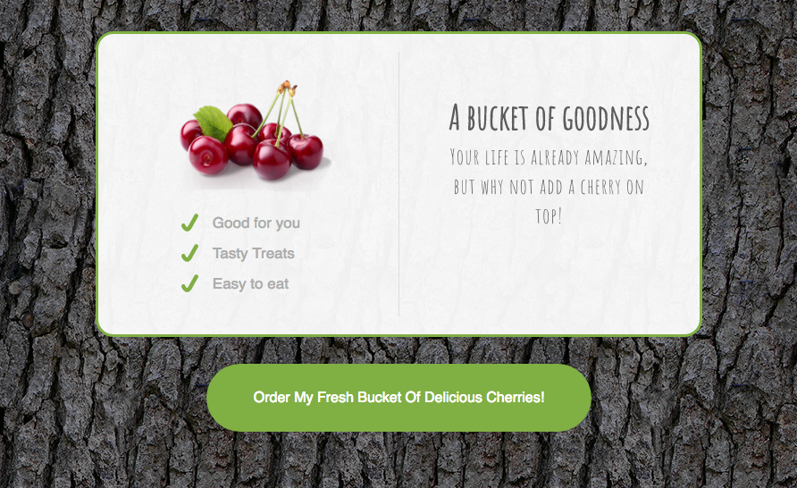
<section id="summary">
<div class="summary-wrap container clearfix">
<div class="summary-left" >
<img>
<ul class="check-mark" >
<li> Good for you </li>
<li> Tasty Treats </li>
<li> Easy to eat </li>
</ul>
</div>
<div class="summary-right" >
<h2>A bucket of goodness</h2>
<p> Your life is already amazing, but why not add a cherry on top! </p>
</div>
</div>
<div class="cta-wrap" >
<a href="#" class="cta-btn" > Order My Fresh Bucket Of Delicious Cherries! </a>
</div>
</section>
</main>
</body>
</html>
As a time saver I’ve added in all the CSS classes and divs we’ll need so we can just focus on the CSS.
Setting up our project
Let’s quickly cover our game plan. Our first step will be to establish the default CSS rules, these will help us step back and define the way basic elements should look across our site. Things like a CSS reset, our fonts, layout, and anything else that will be global CSS styles throughout our website. Then we’ll define the CSS rules for each of our sections starting at the top and work our way down the page.
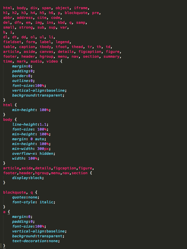
Go ahead and open the CSS document we created in your favorite text editor, and open the index.html in a browser by dragging it into an open window, or right-clicking it and choosing the “open in” option. It will look pretty bad right now without any styles applied yet, but that’s what we’ll be fixing. Inside the CSS file before any of our custom styles, I’m going to add a CSS reset. This will normalize some of the default styles applied by the different browsers. Each browser applies some styles to the page by default, and this can create some annoying little bugs later on. A reset levels the playing field and normalizes some of those differences.
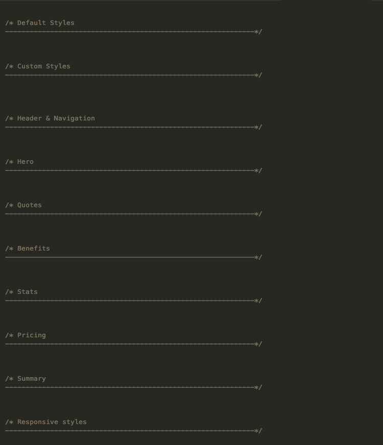
Now we can add our default styles. Below the reset, let’s add some CSS comments that will separate the different sections of our document and make it easier to see what’s going on.
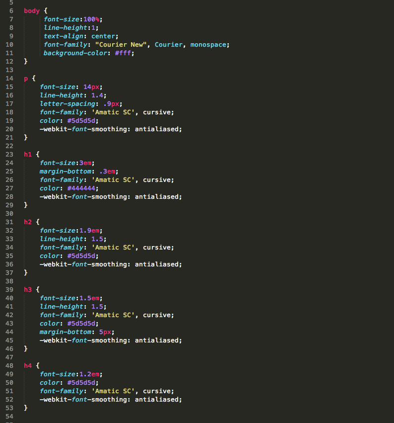
Below the comment for the default styles, let’s add some selectors targeting the heading tags h1, h2, h3 etc. This will define some of the default styles for the font-size, line-height, font-family, and color properties. That being said, we may override some of these properties later should we decide to. We’ll be using the “Amatic SC” font family for the headings. This typeface will create a look that’s more organic which is what I’m going for.
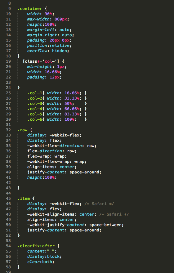
Next, let’s define our layout styles. We’ll go ahead and define a container, row, item, and col class to help us lay out our page. The container class will put a max-width on the content so it won’t expand wider than 860px. In our layout, we also need a class to define rows and columns. We’ll have several predefined widths for the column class, and for our row class will be using CSS flexbox to align the items inside the way we want by setting the flex-direction property to “row”, and the justify-content property to “space-around” so the items inside will be evenly spaced. Let’s also add a clearfix class that will fix a common problem we will run into when floating all of the children items in a parent element. You can research into that more if you’re interested.
Writing our custom styles
Let’s begin working on the main styles of our page!
The hero section
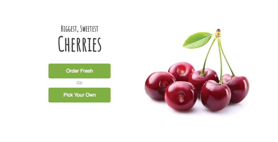
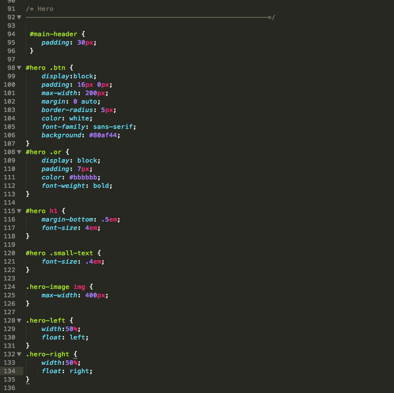
We’ll begin with the hero section. In our mock-up reference, the hero has some white space around it. Because the hero section is in the header, we can add a 30px padding to it that will create some space. The word “cherries” in the main heading will need a larger font size. We can accomplish this by targeting the h1 inside the div with an id of #hero and setting its’ font size to 4em. The rest of the styles will take care of the main buttons, the “or” text between them, and the main image setting it’s max-width to 400px. To create the two column layout like we have in our design mock-up we’ll use the two main divs with a class of hero-right and hero-left, then we’ll set their widths to 50% and float them next to each other.
The review section
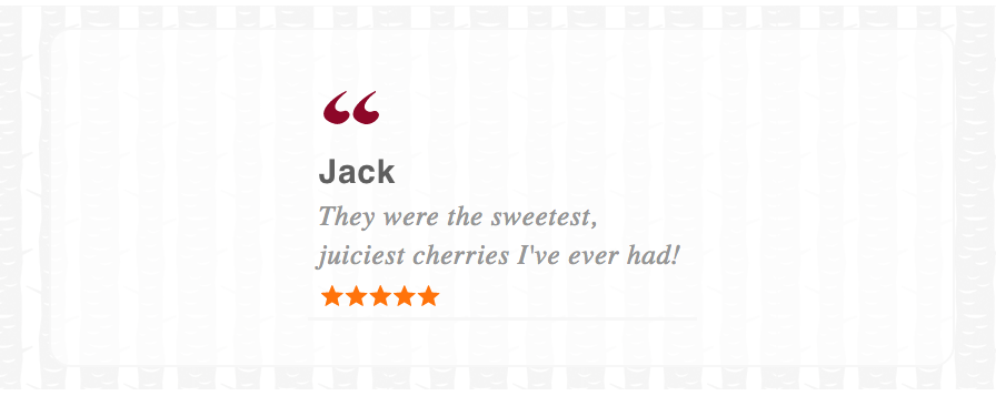
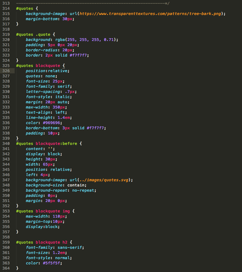
For the review section, we’re going to have only one review displayed at a time. In the HTML, we used a section tag with an id of “quote”. Let’s use this to add our background image. The next div we are interested in has a class of quote, let’s give it a slightly transparent white background so reading each review will be easier on top of the background image. The next element down is the blockquote. To give it quotation marks like we have in the design, we’ll use the CSS pseudo class selector “: before” which lets us add some content before the element it targets. In our case, the content will be a small container with an SVG background image. We’ll also add a few styles for the image element and h2.
The benefits section
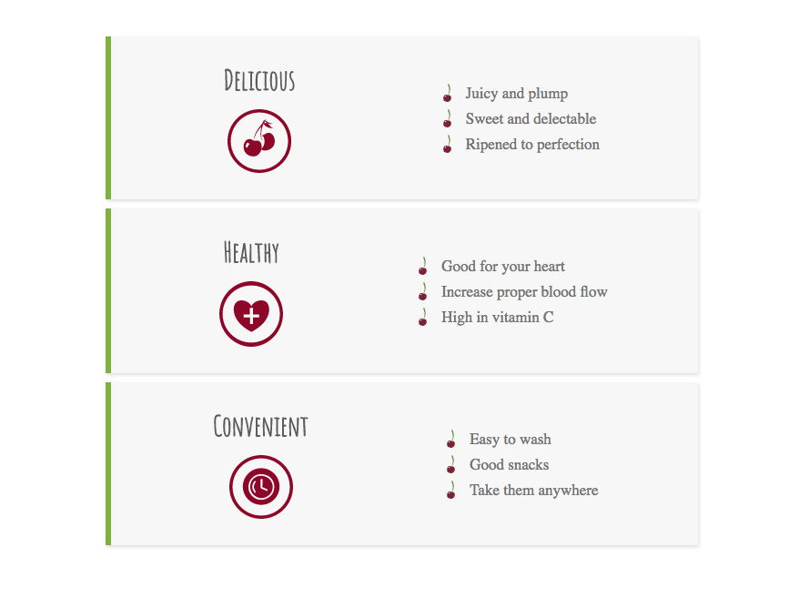
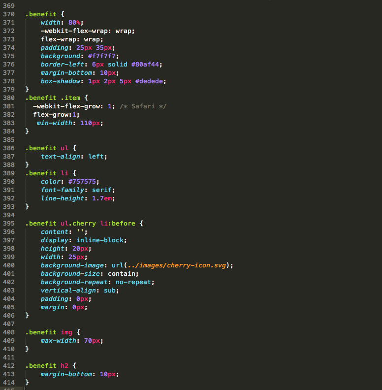
The benefits section contains a list of divs with a class of benefit, and item. To arrange each benefit properly, they’re wrapped in a div with a class of “row”. This class as you may remember from earlier adds the CSS flexbox property. This converts each of the benefits into a flex item that can arrange with the flex property. To make the benefits stand out from each other let’s give them each a margin-bottom of 10px, a green border left of 6px, a background color of an off-white, and a basic box-shadow. That will create some nice separation for them. Each benefit contains two sub-items which will sit side by side when the screen is larger. Because each of the benefits contains an item class, each sub-item lines up in a row. However, because each item has a min-width property of 110px, they will stack on top of each other when the screen gets too small. As you can see, to add a cherry image to each list item we’ll use the “: before” selector again, only this time each image will represent a bullet point.
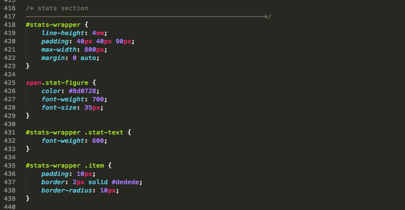
The stats section
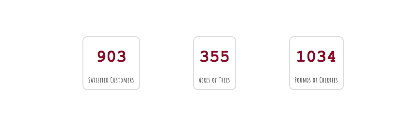
The stats section will be easier. Again, we can use the already defined row and items class to align each stat next to each other in a horizontal row. For each stat item, let’s also go ahead and add a border, some padding, and a border radius. The main figure text inside will be 35px and set to a red font color.
The pricing section
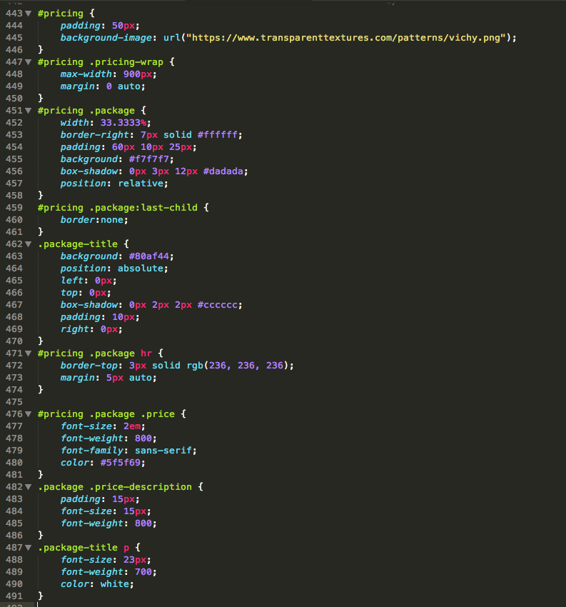
We’re almost done! Let’s work on the pricing section. Just like we did with the stats section, we’ll utilize the row and item classes to arrange each package in a row. In the main section let’s also add a background image property like we did for the review section, with a tablecloth like pattern image. Let’s add some styling rules to make each package look good. We’ll give each package a light gray background color, border, box shadow, some padding and a width of 33.3333%. For the “package-title” to be positioned at the top of each package we’ll set its’ position property to absolute, left 0px, top 0px, right 0px, and finally make sure its parent container (which is the package) has the property of position set to relative so that the title will be absolutely positioned relative to the package. The package price will be large, so let’s set its font size to 2em. The buttons will use the class of “cta” which was defined in our default styles.
The CTA section
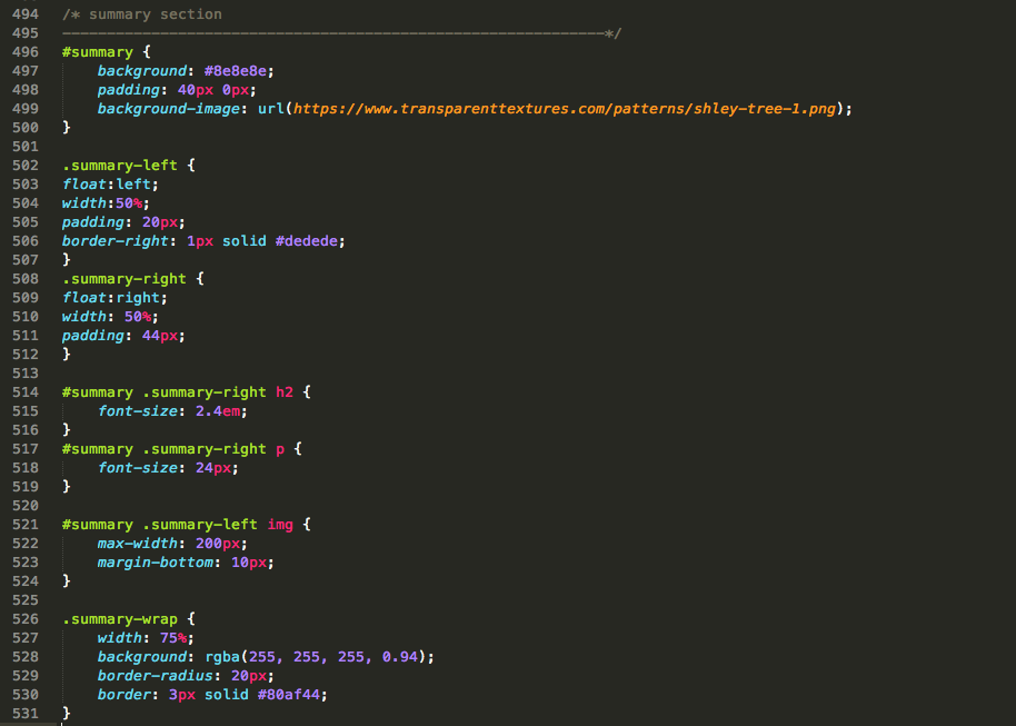
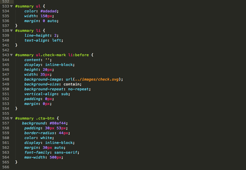
Let’s finish up our last section! The CTA section contains a div with two sub divs. For the main section, we’ll add a background image, let’s do that with the background-image property. We’ll also give it a 40px padding for some space. The main inside has a class of summary-wrap. Let’s give it a white background with a little opacity, also let’s set its width to 75%, give it a border and apply a border radius of 20px to it. To position the two sub divs let’s “float” them beside each other and give them each a width of 50%, they’ll also have some padding and I’ll use the border-right property on the left div to create the faint separation line between them. Next, we can add some rules for the fonts and li tags that we use for our bullet items. We can use the “: before” selector again to add the check mark icons. Finally, let’s make sure the last cta button stands out by giving it a background color of green.
Final words
That’s it. Our basic website is now finished! Of course there’s a lot more we could do, as a website is never really finished, but it’s a good start and hopefully, you now have a better understanding of the thought process to design, markup, and style a website from scratch! In coming articles, I’ll show your examples of how we can use javascript to add some extra functionality to our page. If you’re interested to go further you can take a look at my other articles where I explain how to optimize a website for speed, SEO, and other things that will improve your website!