
This is the first article in a series that will hopefully help you understand the process of how a simple website goes from idea to reality.
Creating a great website isn’t just a random process of throwing some designs together on the web and hoping it works. The process usually consists of several phases; each one help guide us through the correct thought process and create a roadmap that will bring us to the best solution for both design, and function in the most timely fashion.
This process usually consists of the following phases:
-
Research
The research phase helps clarify what our website must accomplish in order to be considered a success.
-
Plan
The planning phase is all about figuring out the best way to structure the content (also known as information architecture) in the best way for the end user. Many other things will be considered during this phase as well.
-
Design
In the design phase, things will begin to take form; this is when the user interface, style guide, and detailed mockups will be created.
-
Build
Once the mockups are ready, the build phase can begin. The database, back-end code, and web pages are created during this phase.
-
Test
As with most software or tools, there will always be room for improvement. This is no different with a website, as such, testing should be an ongoing process.
Each one builds on the one before it and guides us through the best thought process.
In this article, we’re going to cover the design phase. The great thing about the design phase is that you get to let your mind run free and explore different possible solutions. You can begin to experiment within the bounds set by the research and planning phases.
We’ll be using a fictitious business that sells fresh cherries as our design example.
Our design phase will consist of two steps: sketching, and creating a full mock-up.
Creating our sketch
I almost always begin the designing phase with a pencil and paper and not on the computer. I find this helps me eliminate the distractions of color, and pixel perfection while instead allowing me to get my ideas out on paper quickly. It makes me less attached to one idea, and free to experiment around.
After I have something I like, I will bring it into photoshop to begin creating a more detailed mock-up; this is when I will decide on the color palette and fonts.
As I create the mock-up my goal is to bring it as close as I can to the final design. This way I can just focus on the code when I get to the build phase.
I’ve already sketched out some of my ideas for this fictitious brand. These are some of them.
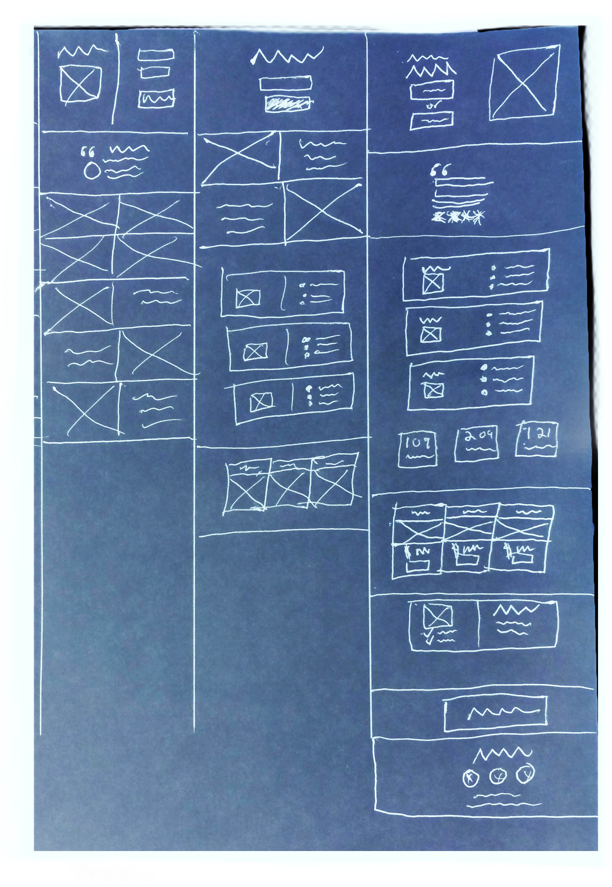
I like where the last one is doing the best so I’m going to run with it.
Creating our mock-up
Let’s now begin creating a more detailed mock-up from the sketch. We’ll begin at the top hero section and work our way down to the bottom of the design.
The goal of this fictitious website is to encourage customers to pick some fresh cherries or order them by mail, for that reason, our first section we’ll need a clear image that shows the product and a CTA button that will let the visitors order the cherries. Let’s create that now.
Here’s what I came up with for the first section:
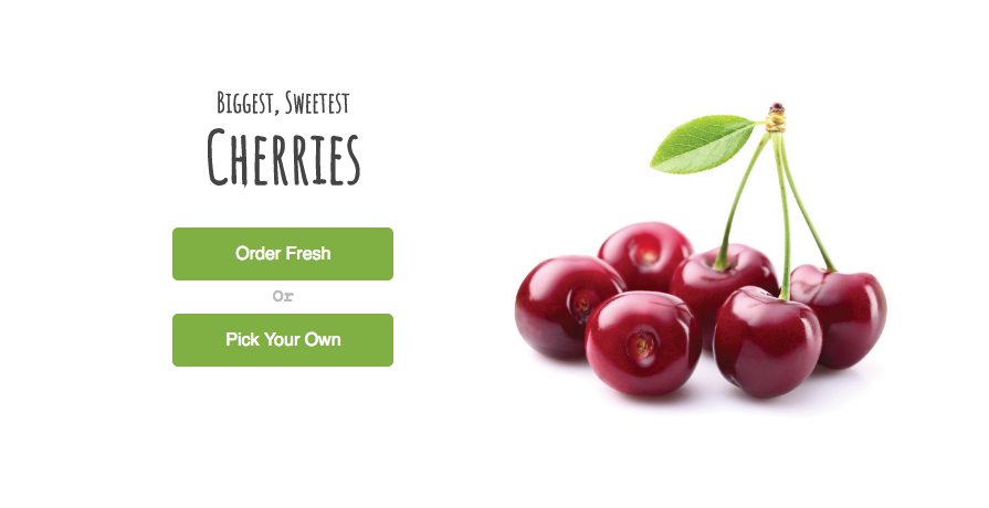
The cherries make my mouth water! It must be working.
Because the page is all about cherries, I think it makes sense to use green and red colors as our theme. We’ll use these colors throughout the rest of the page. Let’s create the next section.
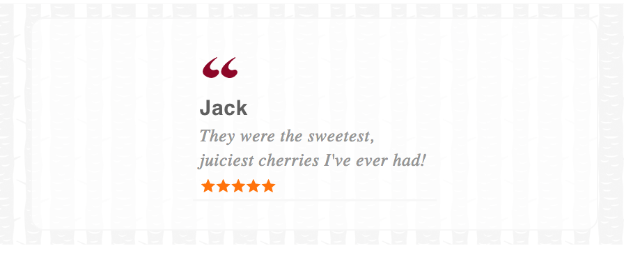
For each review, I think there should be a brief review and rating along with the reviewer’s name. That will let us add some social proof into our design.
Here’s what I came up with for that:
In the benefits section, there will be a few rows each containing a benefit. Each one will have an icon and title with a list of supporting benefit points.
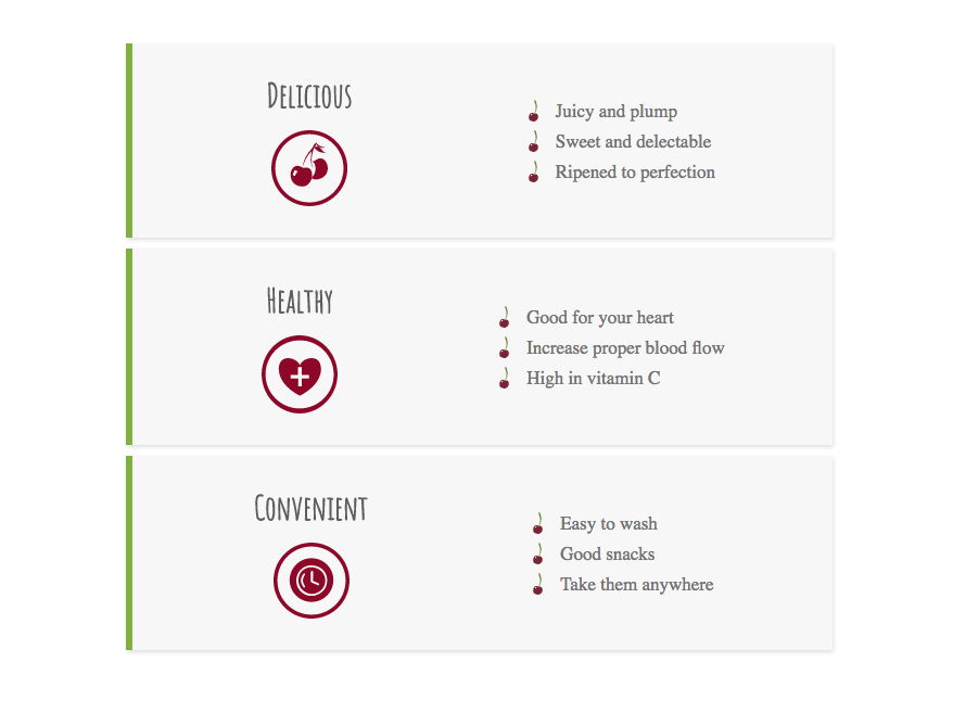
I like the look of separating each one into its own block. This creates a look that’s easier on the eyes.
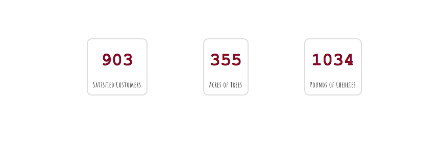
The section for statistics will have three boxes each containing a number for the stat and a description.
Here’s what that will look like:
For the pricing section, we’ll want to create an appealing way of presenting the different packages offered, and drawing attention to the CTA buttons.
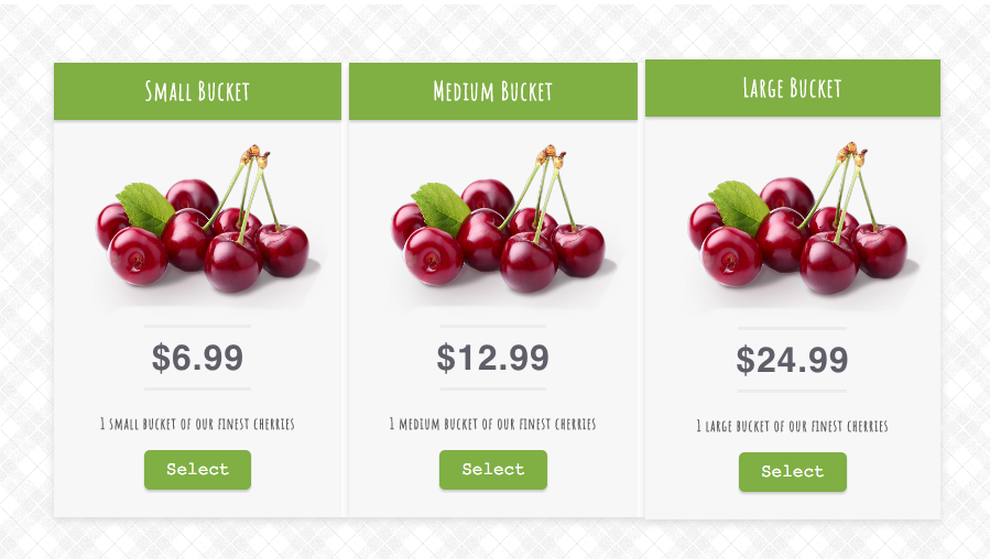
Because of the importance of the pricing section, we’ll want to make sure it stands out from the rest of the design by adding a background pattern which will draw some extra attention. Each package needs to display the image and price prominently so it’s easy to quickly differentiate between them.
And finally, we’ll add a beautiful summary of the selected package and an order button.
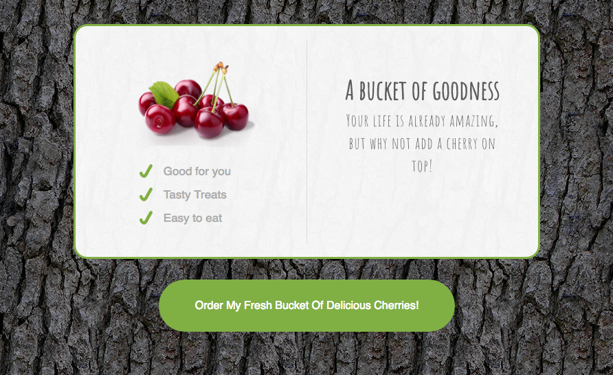
To set this section apart from all the rest I’ve added a nice background image of tree bark, this creates a nice effect and brings the section together.
The next step
Fantastic! We now have our design finished and ready to begin translating it into code, which we will do in the next article: How to build a simple website from scratch.